|
|
Post by Justine on Feb 19, 2013 23:26:59 GMT
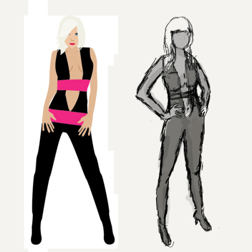
Long time no see! Thought I'll showcase my new character design. The past month I've been self teaching myself drawing technqiues by using a graphic tablet. I decided to recreate a design I did over a year ago, and even though it's rough, it's already better than the original.  |
|
|
|
Post by Lelouch Vi Britannia on Feb 19, 2013 23:49:58 GMT
Arms and hands could use some work. Her right arm (one on the left) is much bigger than her left arm (one on the right. The curve of the right arm looks odd, guess that's suppose to be the bend of her elbow. Fingers on the hands are off, try less space between the pinky and ring finger, making the ring finger slightly smaller and shorter. For the most part the middle finger, ring finger, index finger should be similar in size but differ in length. Middle finger being the longest, ring finger second longest, and index fighter third shortest with the pinky the shortest and being a little smaller than the other fingers. Arms and hands along with the bend of the elbows look a lot better on the right image. Only thing for this one is to continue to work on hands. Keep it up, good work so far.  |
|
|
|
Post by Justine on Feb 22, 2013 4:41:58 GMT
Thanks for the critique. =) Hands are my absolute worst, so it being a rough drawing I sort of skimmed on them. The angle of the arms didn't really show in the first draft because I used a reference, which the model was standing at an angle, not straight ahead. I did another version, cleaning it up a bit, but still a draft.  |
|